 klyvero
Less interface. More intention.
Why the best product decisions often start with what we choose to leave out.
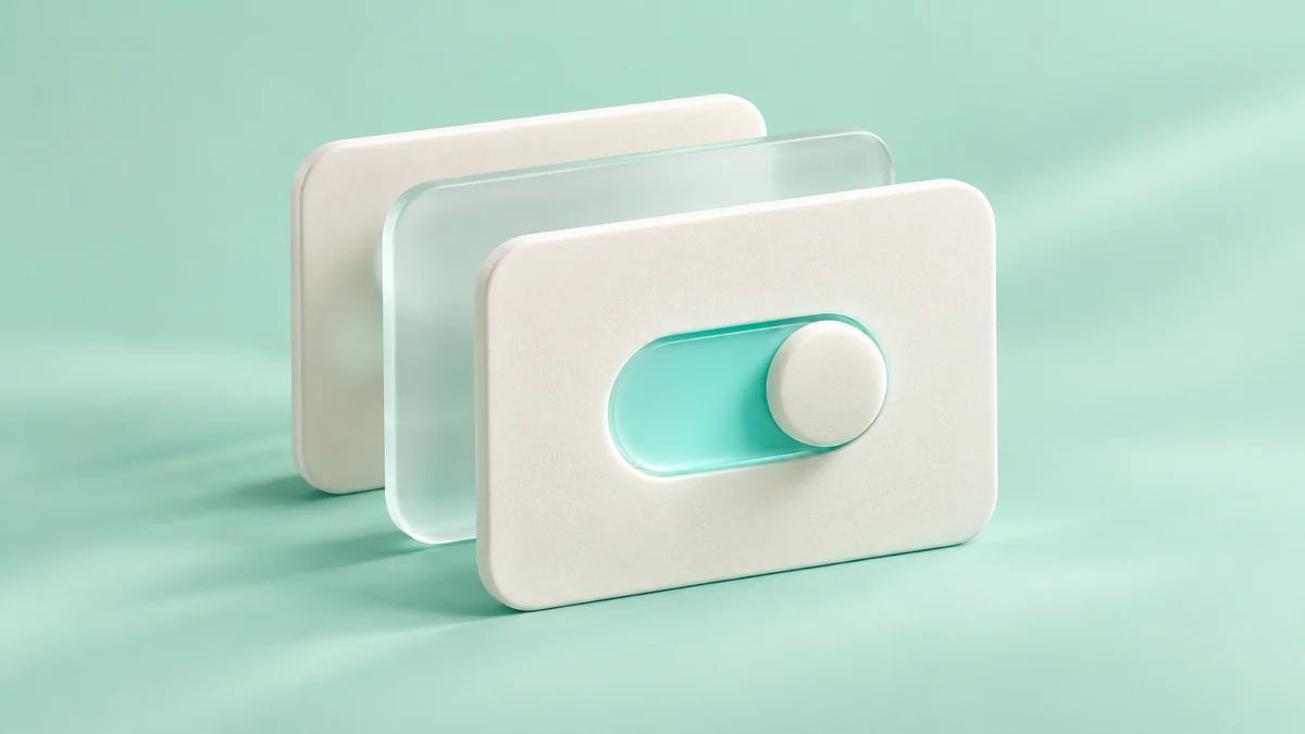
A useful interface gives people a clear path from intention to action. Every competing control asks for a little more attention. Our starting point is to understand the single thing a person came to do.
We sketch that path before adding secondary features. Which choices are essential? Which can wait until they become relevant? Progressive disclosure gives complex products room to grow without putting every option in front of every person.
Clarity also comes from language. A button should explain the action it takes. An error should explain what happened and how to recover. Familiar words reduce the amount of interface someone has to learn.
Our design principle is simple: make the next useful action feel obvious. A smaller interface is only successful when it still gives people everything they need.
Back to the notebook